Editing With Beaver Builder
This page serves as a starting guide for library website editors to build pages using the Beaver Builder WordPress plugin. For more in depth information on Beaver Builder, please refer to the plugin documentation linked within this guide.
Accessing Beaver Builder from WordPress
Via the Classic Editor view

- Login to WordPress
- From the dashboard, navigate to the page you'd like to edit. (Pages can be found through the "Pages" or "My Department Pages" on the left-hand menu)
- Select the Beaver Builder tab above the below the permalink
- Then click on the "Launch Beaver Builder" Button
Via the Tool Bar You can also quickly access it by entering the link to your desired page in your web browser, then select the Beaver Builder option in the Admin Menu at the top of WordPress page.
Intro to the Beaver Builder UI
When Beaver Builder opens, you'll see four main components:

Source: https://docs.wpbeaverbuilder.com/beaver-builder/user-interface/
| Component | What It Does |
| Top Bar (1) | Located at the top. Contains the page title, the Done button, and access to the Tools menu. |
| Tools Menu (2) | Accessed via the arrow (▾) in the top-left. Contains options like History, Publish, and Help. |
| Content Panel (3) | A sidebar for adding rows, modules, and templates (you may not need this for content-only editing). |
| Settings Window (4) | Opens when you click a module to edit it. Contains tabs for content, style, and advanced settings. |
For more information on the Beaver Builder UI, please see the Beaver Builder documentation https://docs.wpbeaverbuilder.com/beaver-builder/user-interface/
Adding A Module
Modules are building blocks that contain content and can be dragged into the main page body. Each module has a specific format for content and can help add text, image, video, and more to support your content building.
- Modules can be found in the Content Panel, which can be opened on the Top bar.
- Click the Plus symbol (+) to open the Content Panel.
- Click the Modules tab to access all standard modules.
- Review which module you'd like to use, click and hold to drag the module into your page
- Editing a Module
Move your mouse cursor over the module you want to configure.
- In the Module overlay actions, click the Wrench icon.
- Configure the module according to your preferences in the module settings window.
- Click Save when you are happy with your changes.

You can also use the Outline Pane to pull up the settings and view all the different modules on your page.
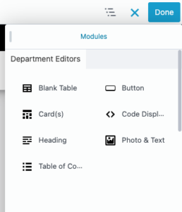
Available Module Types
Here is a list of modules for Northeastern Library Editors to use:
- Blank Table
- Button
- Card(s)
- Code Display
- Heading
- Photo & Text
- Table of Contents
Blank Table
The Blank Table module displays structured data in a clean, accessible table format. It is intended for presenting plain data in rows and columns where relationships between the data points benefit from a tabular layout.
Horizontal

Vertical

General Tab

- Table Title
- An optional title can be added above the table to provide context for the data it contains. Use the title to describe what the table represents, especially when the surrounding page content does not make that immediately clear
- Header Orientation
- The module supports two header orientations. Choose the orientation that most naturally reflects the structure of your data and makes the table easiest to scan.
- Horizontal headers run across the top row of the table. Use this orientation when each column represents a category or attribute and each row represents a distinct entry or record - for example, a list of databases with columns for name, subject, and access type.
- Vertical headers run down the first column of the table. Use this orientation when each row represents a distinct attribute or property being described - for example, a single resource with rows for format, availability, and coverage dates.
- The module supports two header orientations. Choose the orientation that most naturally reflects the structure of your data and makes the table easiest to scan.
Individual Table Column Window

Individual Table Row Window

Mobile Behavior
On smaller screens, the table automatically collapses into a card layout, presenting each row as a self-contained block. This ensures the content remains readable without requiring horizontal scrolling. Keep this behavior in mind when entering data - each row should make sense as a standalone unit when viewed independently on mobile.
When to Use
- Use the Blank Table module when data has a clear row-and-column structure that would be difficult to convey clearly in prose or a list. Tables are well suited for reference content where users need to scan, compare, or look up specific values.
When Not to Use
- For simple lists that don't have multiple attributes - a text block or list module is more appropriate.
- For layout purposes - tables should only be used for data, never to control the visual arrangement of page content.
- When the data has only one column - this is a list, not a table.
- When the content changes frequently and maintaining the table would be burdensome - consider whether a different format or data source would be easier to keep current.
Tips for Editors
Keep cell content concise. Lengthy prose within table cells is difficult to read and degrades the mobile card layout. If a cell requires a lengthy explanation, consider moving that content outside the table and referencing it separately. Always verify that the table renders correctly on mobile after publishing.
Button
Use this module when you want to visually emphasize a navigation action, such as pointing users to a related page or resource. A common example on the library site is a summary or content block that ends with a prominent "Learn more" or "Visit the [X] page" link.
Button Module Example:


Module fields:
- Text: This will be the text that will display within the button.
- Button Color (options): Select from 3 colors.
- Blue: For pages or resources linked within the library website. (i.e: PDFs or media uploaded to the Library website or a page on the Library website.)
- Green: For pages associated with library resources. (i.e: Library Subject Guides, LibApps, Tutorials, Scholar OneSearch, databases, and etc.)
- Red: For external links not directly associated with the library. (i.e: Github, Google, etc.)
- Button Position (options): Choose how the button is aligned on your page.
- Icon: If you have an external link, you can use the "external-link-alt" icon as an indicator for users.
Icon Position (options):
- Before Text
- After Text
- Link: Add the url you want to guide users to.
Card(s)
The Card(s) module displays a collection of visually consistent, pre-styled cards on a page. Each card can include an image, a heading, a block of supporting text, and a link. Cards are well suited for presenting a set of related resources, services, or topics in a scannable, visually engaging format.
Cards(s) Module Example:

General Tab

- Cards
- Card Components
- Photo - Editors select the image source for the card. If no meaningful image is available, consider whether a card format is the right choice for the content.
- Heading - A short, descriptive title for the card. The heading is the primary label for the card's content and should clearly identify what the card represents.
- Link - A URL that makes the entire card clickable. Every card should have a link destination that is relevant and meaningful. Ensure the heading text is descriptive enough to communicate the destination to screen reader users.
- Text - Supporting content that appears beneath the heading. Use this area to provide brief context or a description. Keep it concise - cards are meant to summarize and invite clicks, not replace the destination page.
- Card Components
Single Card Components Window

Display Options Tab

- Card Link Type
- Entire Card - This is selected by default. The link for the title will be the link for the entire card.
- Image & Title Only - Select this option if the link and your content need to go to different destinations.
- Card Image Height
- Fixed - This is selected by default. It ensures that all images are the same height across all cards.
- Auto - The image height of all cards will vary depending on the height of the original image. The height of the tallest image for the row of 3 will determine the height of the other 2 cards in the row.
- Padding (Top)
- No - This is selected by default.
- Yes - Select this option to add padding to the top of the card image.
- Padding (Left & Right)
- No - This is selected by default.
- Yes - Select this option to add padding to the left and right of the card image.
Layout and Responsive Behavior
Cards flow automatically into a grid without requiring editors to specify a column count. Up to three cards sit in a single row; when more than three cards are added, they wrap into additional rows with three cards each. Cards within the same row are equal height, keeping the grid visually consistent regardless of content length.
On smaller screens, the grid adjusts responsively, reducing the number of columns to suit the available screen width and stacking cards as needed on mobile devices.
When to Use
- Use the Card(s) module when presenting a set of related items that each warrant their own visual entry point - such as library services, subject guides, databases, staff resources, or featured collections. Cards work best when the items are roughly parallel in importance and each has a meaningful destination to link to.
When Not to Use
- When only one item needs to be highlighted - a Photo & Text module or a button-style link is more appropriate for a single featured item.
- When the items do not have a link destination - cards are designed around clickable content. Non-linked cards may create a misleading interactive affordance for users.
- When the content requires significant explanation - if each item needs more than a sentence or two of context, a card is likely too constrained a format.
- When items are not visually parallel - mismatched image quality, missing images on some cards, or widely varying text lengths can make the grid feel inconsistent.
Tips for Editors
Keep heading and text lengths consistent across cards in the same module to maintain a clean grid appearance. Since the entire card is clickable, avoid placing additional links within the card text - nested links create accessibility issues and confusing interactions for keyboard and screen reader users. Always use descriptive heading text so the link purpose is clear without additional context.
Code Display
Use the Code Display module when a page needs to present a code sample, command, configuration snippet, or technical reference to the reader. Common use cases include documentation pages, technical guides, and instructional content for library systems or developer-facing resources.
Code Display Module Example:

General Tab

- Programming Language (options): Always select the correct language from the module settings. Choosing the wrong language or defaulting to Plain Text when a specific language is available will result in less readable output. If your language is not in the supported list, use Plain Text.
- Supported Languages: HTML, CSS, JavaScript, PHP, Python, Java, C#, C++, C, Ruby, Go, Rust, Swift, Kotlin, TypeScript, SQL, JSON, XML, YAML, Bash/Shell, PowerShell, Markdown, Dockerfile, Nginx Config, Apache Config, and Plain Text.
- Code: Paste the code you want to display on the page you are editing.
Display Options

- Show Language Label (Yes/No): Displays the programming language in the top left of the module.
- Show Copy Button (Yes/No): Displays a "Copy Code" button on the top right hand side of the module that will allow users to copy the code in the box.
Heading
The page title is always the H1 and is set automatically by WordPress - do not attempt to replicate it using this module. All in-page headings should begin at H2 and follow a logical, nested structure from there.
Heading Module Example:

General Tab

When to Use
Use the Heading module when you need to introduce a new section of content on a page, provide a visible and meaningful label for a content area, or improve scannability for users navigating a long page.
- H2 - Major section headings. Use H2 for the top-level sections of a page. An H2 introduces a distinct topic or area of content that stands on its own. Most pages will use H2 as their primary organizing level.
- H3 - Subsections within an H2. Use H3 for content that belongs under and elaborates on an H2 section. An H3 should not appear on the page without a preceding H2 to give it context.
- H4 - Subsections within an H3. Use H4 for finer subdivisions within an H3 section. If you find yourself reaching for H4 frequently, consider whether the page content might be better organized or split into multiple pages.
- H5 - H6 - Use sparingly. These levels are available for deeply nested content structures but are rarely needed on most library pages. If you are considering H5 or H6, evaluate whether the content hierarchy can be simplified.
When Not to Use
- For the page title - this is handled automatically by WordPress and should not be duplicated.
- To make text look big or bold without semantic purpose - heading levels communicate structure to screen readers and search engines, not just visual styling. If you want emphasized text without a structural heading, use the text editor instead.
- Out of sequence - do not skip heading levels (e.g., jumping from H2 to H4) as this disrupts accessibility and document structure.
Tips for Editors
Keep heading text concise and descriptive. A good heading tells the user what the section is about at a glance. Avoid using punctuation at the end of headings unless the text is a question.
Photo & Text
Use this module when a page would benefit from pairing a visual with supporting content - such as spotlighting a library space, service, or staff resource. It works well for featured content blocks, landing page sections, and anywhere a plain text block feels visually insufficient.
Photo & Text Module Example:

This module combines an image and rich text content in a single, flexible layout. It is suited for introducing a topic, highlighting a service, or adding visual context alongside descriptive or promotional copy.
Layout Options:
The image and text can be displayed side by side or stacked, depending on the needs of the page. When placed side by side, the text can be aligned to the left or right of the image. The width of the text column is also configurable, allowing editors to adjust the balance between image and copy.
Optional Fields:
Both the image and the text fields are optional. You can use the module with text only - for instance, when a styled text block with layout control is needed but no image is available or appropriate. Conversely, you can use the module with an image only, such as when you want to display a standalone photo without accompanying copy. You do not need to populate both fields for the module to be useful.
The image can optionally be linked to another page or resource. Use this when the image itself is meant to be actionable - for example, linking a photo of a service to its dedicated page. If the image is purely decorative or illustrative, leave the link field empty.
General Tab
 Photo Source (options):
- Media Library: Choose from images stored on the Library website.
- URL: Link an image not stored on the Library website.
- Photo: Where the image or url for the image will display.
Link Type:
- None: Won't add a link to the image.
- URL: An input field will appear where you can enter the url you want the image to link to.
Text Block Width (options):
- 100%: The image and content spans the full width of the page's content section.
- 75%: The image will span 25% of the page and the text content will span 75% of the page.
- 66%: The image will span 33% of the page and the text content will span 66% of the page.
- 50%: The image and text content will span half of the page each.
- 33%: The image will span 66% of the page and the text content will span 33% of the page.
- 25%: The image will span 75% of the page and the text content will span 25% of the page.
Text Location (left/right): Choose whether or not you want your text to be on the left or right of an image.
Text Block: Where you will enter text that will display on the page.
Content Navigation
Use this module when a page contains multiple distinct sections that a user might want to navigate to directly - typically three or more. It is especially useful for policy pages, service overviews, FAQs, and other reference content where users are likely scanning for a specific answer rather than reading top to bottom.
This module displays a sticky navigation sidebar above long form content. The sidebar automatically generates its links based on the heading structure in the content editor - no manual list-building required.
Content Navigation Example:

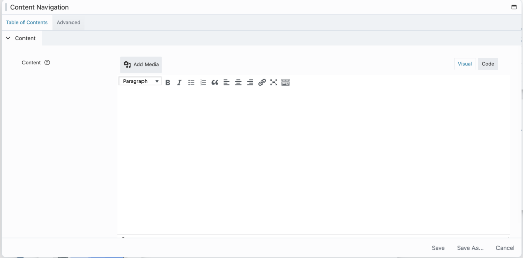
Table of Contents Tab
- Creating sections
- Each Heading 2 in the editor creates a new top-level item in the sidebar. To add a section, place your cursor at the start of a new line, open the format dropdown in the toolbar, and select Heading 2. Type your section title and press Enter to begin writing the section's content below it.
- Adding sub-items
- Heading 3, Heading 4, and Heading 5 headings will appear as nested items underneath the nearest Heading 2 above them in the sidebar. Use these to break a long section into named subsections that readers can jump to directly. The nesting reflects the heading hierarchy - Heading 4 nests under Heading 3, and Heading 5 nests under Heading 4.
Tips for Editors
- Every heading you add becomes a clickable anchor link in the sidebar automatically.
- Avoid skipping heading levels (e.g. jumping from Heading 2 straight to Heading 4) as this can create confusing sidebar nesting.
- Input content as plain text and then insert media. Format headers the content navigation header.
Adding CSS/HTML
HTML styling can be added to improve the spacing of your text and can be added through the Text Module.
Once the text module is open, select the code tab on the upper right corner of the editing box.

Please note that this is only mean to be used for spacing and padding of headings and images. Please do not attempt to change colors, fonts as it will not render due to the website defaults.
If considering adding Libapp widgets to the website, please first notify LTS first and include the widget code.
Saving/Publishing Your Changes
When you are done editing, click the blue Done button in the top-right corner. You'll see three options:
| Option | What It Does |
| Publish | Makes your changes live on the website immediately. History is cleared. |
| Save Draft | Saves your changes without publishing them . History is preserved for the next session. |
| Discard | Throws away all unsaved changes since your last publish. History is preserved. |
If this is a new page, confirm that your page is published in the classic editor before leaving the page.
Click on "Edit Page" in the Admin menu or navigate to the page view in the WordPress Dashboard
Confirm if the Publish Status: is correct.

Please Note! Only edit your in Beaver Builder if that is your main method of content editing. Switching back and forth between Beaver Builder and the classic editor will cause issues with your content.
Emptying your cache after finalizing your changes
Sometimes, changes will be saved on BB but they will not show up on your browser. Please be sure to clear your cache if you notice your changes aren't showing up on the live website.

Need More Help?
Official Docs: docs.wpbeaverbuilder.com
Video tutorial: Open the Tools menu (▾) inside the editor and select Help to watch an introductory video.